Transit Flood Hazards
An exercise in utilizing geodatabases as a method of organizing data. (None of that's visually evident in the end-product, but all the data is neatly aggregated for anyone else who might work with the same data).
-
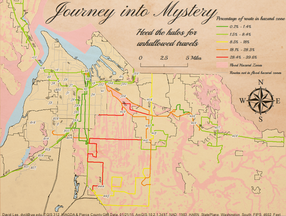
Data sources (Pierce Transit bus routes & flood hazard zones) were gathered from various data sources, and projected & aligned together.
-
Preliminary data came in the form of a network of line segments covering much of the Puget Sound Region. These were aggregated into their proper bus routes and excised to just the relevant county spatial frame.
-
Stretches of routes passing through flood hazard zones were calculated against the whole, with this percentage represented by color.
-
This was a full-bleed experiment in formatting images especially for web.
Historical alternate
A stylistic pastiche inspired by historical cartography and warnings, and a personal challenge to test the edges of ArcGIS's finicky formatting.
-
The background is a tweaked creative-commons-license aged paper texture by Tomasz Grabowiecki.
-
ArcGIS only selectively allows for transparent components, and primarily in "data" rather than "layout" view.
-
Sometimes the output file does not always resemble what is presented within the program, so various workarounds must ultilize other programs. (See below)